Web Design

Search Engine Optimized Websites Tailored to Your Business and Target Audience

Future-proof Your Website with Responsive Web Design


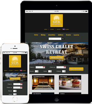
I design my websites with a mobile-first approach. This means that I design how the website will look like on a smart device first and then create the desktop version. The technology that makes this possible is HTML5 and CSS3. The design approach is called responsive design. Responsive design means that your website will look good no matter what device your visitors are using and it eliminates the need for a separate mobile version of your site or a smart phone app version of your site.

  • Mobile, Table and Desktop Versions
  • Built with a mobile-first design approach
  • Eliminate the need for a separate mobile version of your site

A Good User Experience Ensures Repeat Visitors


Wireframe Example

To your website's visitors, it’s not about more features; it’s about an easy to use and enjoyable experience. Website UX has many parts including your site's branding, usability, information architecture, functionality, content, images and iconography. It is the sum total of all these parts that add up to an overall experience that keeps your website visitors coming back.

Build Your Site with the World's Most Popular Content Management System


WordPress Logo

WordPress(WP) is the world’s most popular content management system (CMS) and it’s also the best CMS for search engine optimization. Using WordPress as your content management system means that you can update your content, from any computer, without relying on your IT staff. Also, adding functionality to your site is just a simple matter of choosing from one of the thousands of free plugins.

  • Update and manage your site using your browser
  • WordPress is SEO friendly
  • Your WP site grows as your business grows